Today, in 2024, companies are promoting data culture and transforming their data analytics game like never before!
BI adoption is at its all-time high. Power BI with its immensely crazy BI capabilities is making it even more easy for businesses to begin with their BI initiatives.
Microsoft Power BI holds a 13.62% market share in the BI market with 97538 companies using it.
Of all companies that are using Microsoft Power BI, 46% are small (<$50M in revenue), 21% are medium-sized and 28% are large (>$1000M revenue).
~ as per Enlyft
Businesses are thriving based on insights that are actionable and making well-informed business decisions backed by data.
- They have data on the current industry trends
- They have data on customer experience
- They have data on technology usage
- They have data on productivity
- They have data on employees
There is almost nothing that they don’t have data on.
But trust us when we say this, if you keep sitting on that data without using the superpower of Power BI and reporting services, you are choosing stone age over data age.
Thinking about “How should I strike an edge in this fiercely competitive BI landscape?”
Easier than anything – invest in Power BI reporting services.
Thinking about “How will it make a difference?”
Fret not! You have landed at the right resource.
Today, we’ll discuss about –
- Different shades of Power BI reporting with types of visualizations
- Popular types of Power BI reports that alleviate business growth
Without any further ado, let’s set the ball rolling.
Power BI Reporting – Types of Visualizations
Talking about Power BI and reporting services, the mention of visualizations is non-negotiable.
There are a bunch of visualizations that you can utilize when working with Power BI reporting tool. What makes choosing the right visualization even more daunting is the variety that Power BI offers.
Afterall, it’s the magic of visualizations that makes decision making easier than ever, isn’t it?
Thinking about “How could one choose the right visualization for Power BI reporting needs?”
No matter who spins the expertise behind creating compelling reports, it’s a must to figure out answers to the following set of questions –
- What’s the purpose of creating this report?
- Who is the target audience for the report?
- Will it be familiar with the visualizations?
- Are the visuals suited for specific data?
- Does the visual provide apt insights?
Answers to these questions will make your Power BI reporting game on point.
Not to mention separately, Power BI custom visualizations is yet another alternative you could explore. It allows you to leverage your brand style guide & color preferences through custom visuals that you avail from AppSource.
We said a lot already about Power BI reporting & visualizations. Let’s now explore some popular Power BI visualizations besides their strengths, weaknesses & application.
Let’s set the ball rolling.
Pie Charts
Pie chart, the name is self-explanatory. The simplest & easiest type of visualizations used to create insightful Power BI reports.
Pie charts represent data in a circular graph. The pie, that is the complete circle represents the whole proportion of a category, where the slices depict subcategories with even the minute share of contributions.
Let’s understand this with an example
Assume you are a teacher willing to understand the personal likings of subjects that your class of students have.
Problem
You have cluttered data collected on individual students’ likings of subjects. You are looking for a clear distinction between the variety of subjects & students that like these subjects.
Solution
You decided to get the help of Power BI and reporting services to simplify the data analysis.
Result
With a simplified Power BI report, you now have detailed insights into students’ preferences & likings. This helped you make informed decisions while planning the curriculum and extracurricular activities.
Pie charts in Power BI reporting are pivotal when you must have a proportional makeup between multiple categories. The accuracy of the analysis may falter when there are multiple categories with the same value/contribution.
It would be ideal to explore other Power BI reporting alternatives for accuracy & distinct comparison.
Donut Chart
Often considered synonymous, Power BI Pie charts and Donut charts are closely related types of data visualization in Power BI reports.
However, there’s a primary difference between the two- the Donut chart has a hole in the middle, and the pie chart doesn’t.
Just like a Pie chart, a Donut chart represents data organized in columns or rows. And just like a Pie chart, the Donut chart showcases the relationship of parts to a whole.
With 1 difference – a Donut chart can contain more than 1 data series. Each new data series that you update in a Donut chart adds a ring to the chart.
Let’s understand this better with the help of an example.
Assume you’re the manager of a retail company that wants to explore its distribution process across the state and spot areas to increase profitability.
Problem
The large volume of complex data sets about operational expenses, inventory levels, and transportation costs makes it challenging to identify the key areas.
Solution
You decided to use the help of Power BI and reporting services to facilitate the data analysis.
Result
With simplified reports in Power BI, you now have direct insights into the distribution process. This helped you spot inefficiencies and make data-backed decisions to boost profitability.
Column Chart
Another staple in the world of Power BI data visualization is the Column Chart.
It’s an effective way to graphically visualize and compare distinct categories.
The height of the column depends on the value provided.
Let’s understand how column charts help you visualize Power BI reports effectively with the help of an illustration.
Assume you are the head of a Marketing agency.
Problem
Your marketing team wants to gauge the performance of various advertising campaigns running across different social media channels.
Solution
You decided to opt for Power BI and reporting services to perform a comprehensive analysis.
Result
With Power BI reports with column charts, you have the data on top-performing campaigns and poor-performing campaigns. This enabled your team to optimize your marketing strategies and distribute budgets effectively, leading to better ROI for your clients.
Bar Chart
Power BI bar charts or bar graphs are column charts turned horizontal.
The height of each bar denotes the mean of the data set, and its width denotes the spread of the data set.
Let’s understand this with an example.
Assume you’re a project manager supervising multiple construction projects.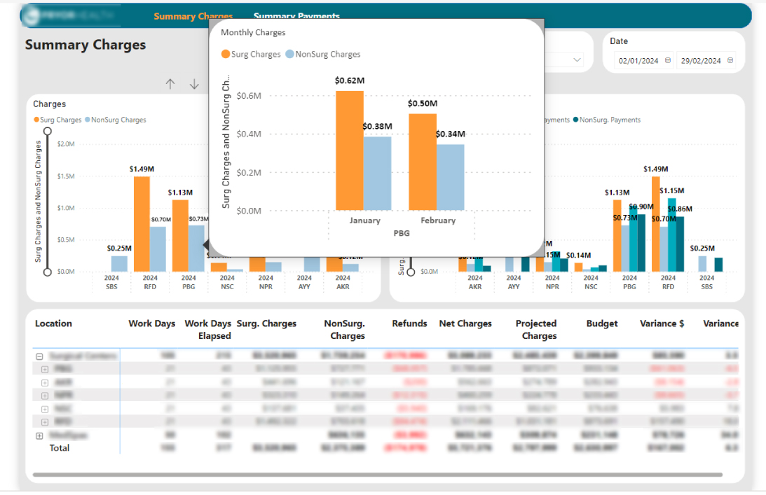
Problem
You are unable to keep track of the progress of multiple construction projects, and pinpoint which projects are on time and which ones are lagging behind.
Solution
You decided to invest in PowerBI reporting services to monitor multiple projects.
Result
With a simplified Power BI report consisting of bar charts, you can now identify the project status, and prioritize resources to maintain the momentum of the projects.
Line Chart
Popularly seen on Google Trends, a Line Chart is also known as a line graph or a line plot.
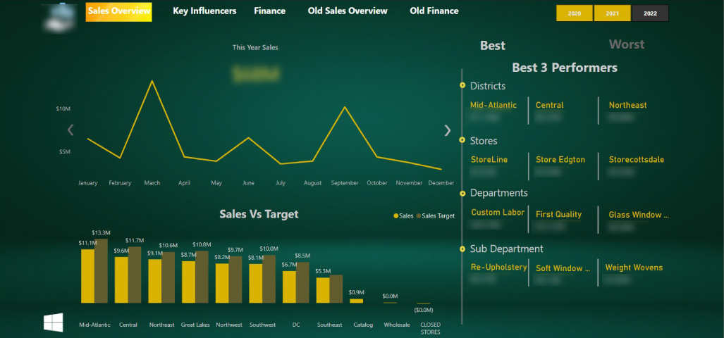
This type of Power BI visualization connects a series of data points using a single line, which effectively supports monitoring behavior in your data set.
Line Chart PBI report helps track changes over time and highlight differences and correlations within your data. Moreover, it may help make predictions about the results for which data is not yet recorded.
Let’s understand this better with the help of an illustration.
Assume you are the CEO of a young tech startup.
Problem
Your company wants to track the monthly sales of a newly launched product line over the past year to spot hidden trends.
Solution
You decided to seek the help of Power BI and reporting services to simplify data analysis.
Result
By analyzing the Power BI reports using Line Chart, you now have the sales performance trends for your new product line. This helped you predict future sales and optimize inventory, marketing, and product development efforts.
Area Chart
The Area Chart Microsoft Power BI report resembles line charts along with the shading between lines and a baseline, like in a bar chart.
It’s a simple and clear way of displaying the evolution of various data series over time or categories, emphasizing both individual patterns and the overall trend.
Let’s understand this better with the help of an example.
Assume that you are the CTO of a healthcare organization.
Problem
Your team is failing to track patient admission rates for diverse departments. This hampers efficient resource allocation and the ability to identify patterns.
Solution
You decide to leverage Power BI and reporting services to streamline data visualization.
Result
With a simplified Power BI report built using area charts, you now have detailed insights into the admission rates of all departments. This helped you understand seasonal fluctuations, allowing you to adjust staffing levels and resources efficiently.
Combo Chart
What if you needed to combine column, bar, line, and area charts into 1 super-chart?
This is where the Power BI Combo Chart comes into the picture.
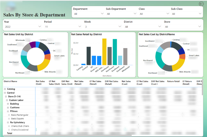
As the name suggests, a combination chart uses multiple chart types on the same visual.
Combo charts best suit Power BI reporting needs when different kinds of data are to be presented in one chart, to provide overall and versatile data truth.
Let’s understand this Power BI visualization type better with the help of an example.
Assume that you’re the CFO of an e-commerce company.
Problem
You’re tasked with presenting and comparing marketing spend, sales revenue, and operational expenses metrics concurrently. The aim is to provide a wholesome understanding of overall company performance to set the upcoming year’s budget.
Solution
You decided to invest in Power BI financial reporting services to get a comprehensive view.
Result
By analyzing the Power BI Combo Chart, you’re able to provide direct insights into trends and patterns across different business verticals. This helped formulate a well-informed budget for the upcoming year and enabled strategic resource allocation.
Waterfall Chart
While Power BI waterfall charts share certain similarities with column charts, they have a special objective. It shows a running total as values are added or subtracted.
Waterfall charts Power BI reports showcase the addition as a process, providing the user with a detailed breakdown of the data. Instead of starting from zero, the succeeding column starts where the previous column ended.
Let’s understand this better with the help of an illustration.
Assume that you’re the CEO of an e-commerce company.
Problem
You’re struggling to analyze your company’s monthly sales performance. You need to gain insights into the various factors affecting the changes in overall sales performance.
Solution
You decided to get the help of Power BI and reporting services to simplify the analysis.
Result
By utilizing Power BI’s Waterfall Charts, you are able to track the addition and subtraction of revenue factors. Moreover, you glean deepened insights into the dynamics of your company’s sales performance.
Map Charts
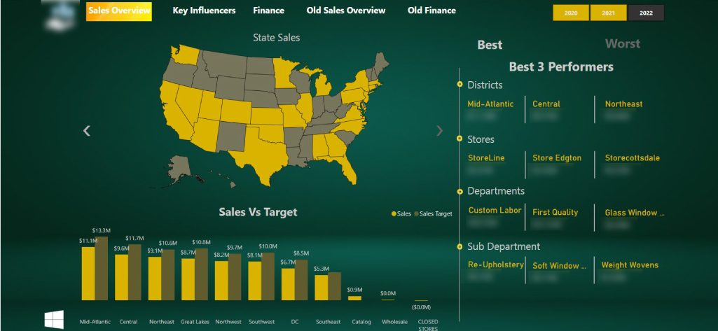
Power BI Map Charts are useful when the data has geographical connotations and spatial relationships.
This type of visualization in the Power BI reports employs geographical maps as a backdrop to present points and statistical data.
Let’s understand this better with the help of an illustration.
Assume that you’re a real estate developer.
Problem
You need to analyze the property prices and market trends across different vicinities to spot smart investment prospects.
Solution
You decide to opt for Power BI and reporting services to analyze property prices and market trends geographically.
Result
You are enabled to overlay statistical data onto geographical maps and get a clear view of pricing dynamics across the vicinity. This further empowered you to make smart choices and maximize return on your investments.
Network Charts
Along with visualizing the data relationships, sometimes you need to visualize the relationships between data points.
This type of visualization in Power BI reports displays each data point as a node which is connected by links to show that one node belongs to another.
It allows users to analyze the relationships between disparate data points
in a visually intuitive manner.
Let’s understand the Power BI Network Chart better with the help of an illustration.
Assume you are a food delivery partner.
Problem
Your food delivery company needs to understand the transportation network better to optimize routes.
Solution
You decided to opt for Power BI and reporting services to identify bottlenecks.
Result
With simplified Power BI reports using network chart, you gained deep insights into the different transportation hubs, allowing you to spot the best routes, minimize the time in transit, and lower the operational expense. This translated into faster customer service, better efficiency, and improved profitability.
Now, as you are aware of the popular visualizations used in Power BI reporting, let’s move ahead and look at the different types of reports you can create using Power BI reporting services.
Power BI Reporting – Types & File Formats
Power BI reports (.pbix)
Power BI reports is the primary reporting format you would use with Power BI.
Power BI reports is the primary reporting format you would use with Power BI.
These reports are stored as zip files or compressed files, and comprise of data model, meta data, visualizations & layouts.
One distinction to have a note of is –
When stored locally, the report file is a compressed file containing visualizations & data. This helps save & share Power BI reports & data models, locally.
When published on the Power BI service, the data & reports are treated as two different objects. Out of which one is the dataset & other is the report, with the same file name. If you download the report from the Power BI service, those two objects will be merged again into a single report file.
Power BI reports(.pbix) offer rich data visualization & storytelling alternatives.
Paginated Reports(.rdl)
Paginated reports are highly formatted & optimized for printing.
If your reporting needs demand printing forms or operational reports like invoices or transcripts, paginated reports solve the purpose for you.
Paginated reports, when published on the Power BI service, are stored as a single object unlike Power BI reports.
Creating paginated reports poses a steep learning curve compared to Power BI reports. Yet, the finer control over the layout, placements, enhanced printing & exporting capabilities offers an edge.
Additionally, Paginated reports display all the data in tabular format irrespective of the pages spanned. On a different note, paginated reports lack some key features that Power BI reports have to offer like interactivity, dashboards & comments.
Paginated reports rely on Microsoft’s Report Definition Language (RDL) reporting tactics in SQL Server Reporting Services. Support for paginated reports in Power BI declines the need for a separate SQL server environment.
Types of Reports You Can Create Using Power BI Reporting
Businesses whose CEOs make data-backed decisions are 77% more likely to achieve success. – According to a Deloitte survey.
This insight throws light on the importance of clarity & relevancy of data while making crucial business decisions.
Till now, we have seen some popular visualizations that uplift the power of Power BI reports besides the file formats supported.
Now, let’s understand different types of Power BI reports based on a variety of business functions that businesses have.
Let’s get going
Sales Analysis using Power BI Report
You don’t need us to break down the importance of analyzing sales performance, do you?
Sales. One of the most crucial business functions, as it is the ultimate decider of growth.
Thinking “What difference will Power BI reporting make in sales analysis?”
With Power BI and reporting services you will have actionable insights with finer details into –
- Sales by region
- Total sales revenue
- Top-selling products
- Sales trends over time
- Sales by product category
- Sales by customer segment
- Contribution margin analysis
- Sales by salesperson or team
- Sales by time period (daily, weekly, monthly)
- Sales performance comparison (year-over-year, month-over-month)
With these anecdotes, you will be spoilt for choice with the areas of improvement in your overall sales performance.
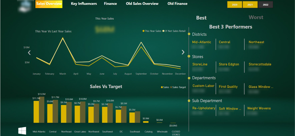
Let’s better reflect on this scenario with the help of an example.
Assume you are the CIO of a consumer goods company.
Problem
You are struggling to identify sales trends, optimize inventory, and target the right customer segments effectively.
Solution
You decide to rope in a Power BI partner to utilize Power BI reporting services. The goal is to integrate diverse data sources and gain actionable insights to improve sales performance.
Result
Vetted Power BI experts helped you identify best-selling products and optimize resource Allocation. You are now experiencing data-backed inventory management with reduced events of stockouts. With deepened insights into customer preferences, your sales performance is reaching new heights.
Simply put –
Problem was “declining sales performance”
Solution approached was “Power BI reporting services”
ROI yielded was “Boosted sales & improved customer loyalty”
Financial Reporting with Power BI
It all starts with Finance, and you too as a business leader would agree when we say this.
CFOs of businesses undergo a lot as they are solely in the position to account for everything that costs money.
Entrusting Power BI and reporting services for financial reporting is a win-win for both CFOs and CTOs/CIOs as it makes their jobs easy.
Thinking “How?”
Simple. By advocating their actions with legitimate data points.
Thinking “What data points does financial reporting with Power BI brings up?”
Here’s the list –
- Revenue analysis
- Budget variance analysis
- Cash flow statement analysis
- Forecasting and trend analysis
- Return on investment (ROI) analysis
- Risk assessment and mitigation strategies
- Financial ratios (liquidity, solvency, profitability)
- Balance sheet analysis (assets, liabilities, equity)
- Profitability metrics (gross profit margin, net profit margin)
- Expense analysis (operating expenses, cost of goods sold)
These numbers will speak volumes for CEOs/CTOs about the investments they ask for from CFOs. And CFOs can rock with these anecdotes during the board meetings.
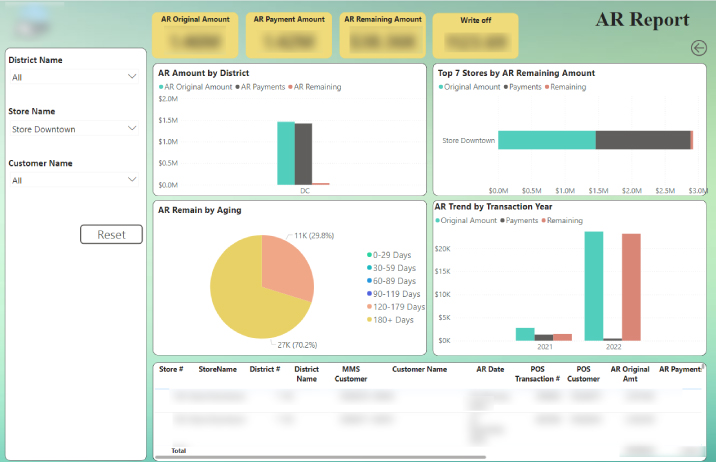
Imagine CFOs struggling with lack of insights on the ROI.
Now, reverse the situation with detailed financial reporting with Power BI on every penny spent.
That’s the power of data.
Let’s better understand this scenario with an example.
Assume you are the CFO of a manufacturing company.
Problem
You are facing challenges in tracking production costs, monitoring inventory levels, and managing cash flow effectively.
Solution
You decide to invest in Power BI and reporting services for financial analysis. The aim is to accumulate dispersed financial records and put them together for a connected view.
Result
You are now experiencing significant deviation in financial performance. You are enabled to monitor the production costs accurately and track inventory to avoid events of overstocking. You are now empowered to devise data-backed cost-saving strategies.
Simply put –
Problem was “distorted financial management”
Solution approached was “financial reporting with Power BI services”
ROI yielded was “Improved cost control measures & financial performance”
Power BI Reporting on Customer Profitability
Customer profitability depicts the growth KPIs for your business and assures you if you should anticipate a shift in direction.
Power BI and reporting services open up avenues for you to boost customer profitability.
Thinking “How?”
Here’s how –
- Customer churn rate
- Profit margin per customer
- Lifetime value of the customer
- Cost of acquisition per customer
- Revenue generated per customer
- Customer profitability trend analysis
- Customer acquisition and retention costs
- Contribution margin analysis by customer
- Customer segmentation based on profitability
- Comparison of profitability across customer segments or demographics
This data captured through various Power BI reports wins you an opportunity to get to know your customers & their preferences better.
As a result, you are set to approach your customers with an even more personalized approach.
Let’s understand this scenario with an example.
Assume you are CMO of a retail company.
Problem
You are struggling to understand customer behavior, measure marketing campaign effectiveness, and optimize promotional strategies.
Solution
You decide to invest in Power BI reporting services to leverage profound expertise. The goal is to understand customer demographics, purchasing behavior, and optimize conversions.
Result
With Power BI reporting, you are enabled to monitor your marketing campaigns closely. You are now tracking the campaign performance in real-time & maximizing the ROIs on marketing investments.
Simply put-
Problem was “declining marketing campaigns”
Solution approached was “Power BI and reporting services”
ROI yielded was “Improved performance of marketing campaigns & ROI”
Conclusion
As a business leader, we believe you deserve nothing less than the best for your business, when it’s about choosing Power BI reporting services partner.
We are certain that you are now clear on how essential it is to understand your business’s data needs, and how Microsoft Power BI reports make a difference.
We are confident that you are looking forward to a reliable Power BI partner who understands your business and Power BI reporting needs, prominently.
We, at Integrative Systems, are certified Microsoft Partners with over 10+ years of experience helping leaders like you to make impactful decisions.
And, we would take immense pride in becoming Power BI and reporting services partner of your choice.
Have the feeling that we are the match?
Drop us a line at contact@integrativesystems.com and we shall circle back in 2 business days, to take it from there.
Frequently Asked Questions About Power BI Reporting
1. What are Power BI reporting services?
Power BI report server serves as an on-premises report hub, featuring a user-friendly web portal for showcasing and overseeing reports and KPIs. It includes a suite of tools for crafting various report types, including Power BI reports, paginated reports, mobile reports, and KPI dashboards, offering comprehensive reporting capabilities within your organization’s infrastructure.
2. How is Power BI used for Reporting?
In the typical Power BI workflow, you start by gathering data from various sources using Power BI desktop and crafting a comprehensive report. Once completed, you publish this report to the Power BI service, enabling easy access and sharing with colleagues across different devices, promoting collaborative data analysis and informed decision-making.
3. What is the difference between Power BI report and Power BI service?
In brief, Power BI Service caters to organizations seeking the convenience and adaptability of cloud-based data analytics. Meanwhile, Power BI Report Server is tailored for those prioritizing stringent data governance or favoring on-premises data hosting, offering a solution that aligns with their specific requirements and preferences.
4. What are Power BI services?
The Power BI service stands as a cloud-based solution, known as software as a service (SaaS), facilitating seamless report editing and team collaboration. While it enables data source connectivity, its modeling capabilities are somewhat restricted. Nonetheless, it empowers teams and organizations to collaborate effectively on report creation and analysis, leveraging cloud-based convenience.











One Reply to “Power BI and Reporting Services – Everything You Must Know”
Lucas Hall
Excellent insights! This article effectively highlights the benefits of Power BI Reporting Services, showcasing its value for businesses.